
Why Mobile-Friendly Website Design Is Essential for Modern Businesses
 xt-admin
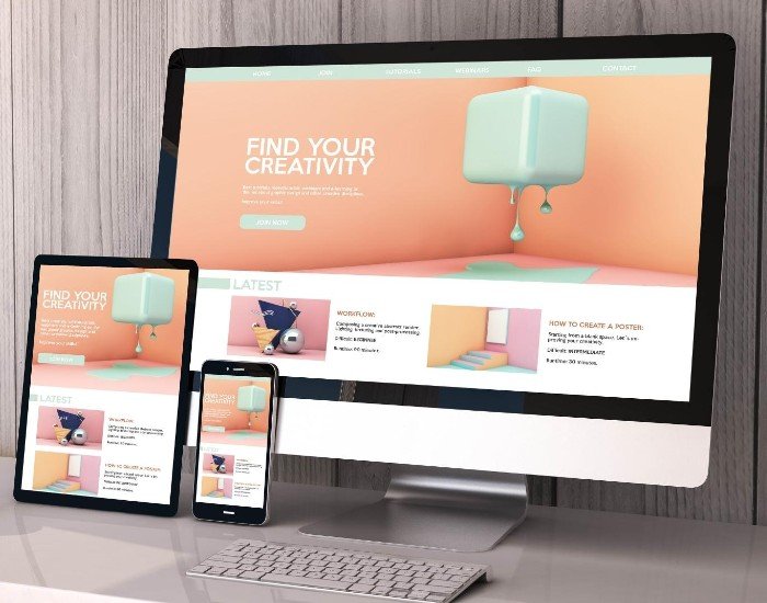
A company’s website is often the first place people will go to learn more about your company or services and compare solutions. With so many people using mobile devices such as smartphones and tablets to surf the web now.
A quick and easy to navigate website will help your visitors easily find the information they need, explore your services and get in touch. However if your site is hard to navigate, takes long to load and is not well laid out then your visitors may become put off.
By having a mobile friendly website design you will improve your users browsing experience, help with SEO and connect with your customers on multiple devices.
What Is Mobile-Friendly Website Design?
Creating a mobile-friendly website means designing your site in such a way that it can be used on smartphones and other smaller screens. It will allow users to easily consume content, navigate and see images on your site.
Typically a mobile friendly website will have;
- Responsive designs.
- Easy to read text.
- Easy to navigate with clearly defined menus.
- Appropriate sized buttons.
- Optimised images and fast loading speeds.
- Easy to fill in forms.
This means your site can be used easily and will have consistency when using it across different devices such as smartphones, tablets, laptops and desktops.
7 Reasons Mobile-Friendly Website Design Is Important for Businesses
1. Improves User Experience
Visitors expect websites to be easy to navigate, regardless of the device they use. If users struggle to read text, click buttons, or find important information, they may leave before exploring the business further.
A well-designed mobile experience helps visitors:
- Find services and products quickly.
- Read website content comfortably.
- Navigate between different pages.
- Contact the business with less effort.
2. Supports Search Engine Visibility
Mobile friendly websites are very important when implementing your SEO strategy. Google will mainly use the mobile version of your content to index and rank your site.
A responsive design will ensure your content is easily searched for by search engines.
Your business should include:
- Content that is consistent across both desktop and mobile.
- Proper headings.
- Mobile friendly.
- Fast loading.
- Search engine friendly navigation.
However, having a responsive design won’t guarantee your site will rank higher. But it will work with other factors of SEO such as high quality content, performance and authority.
3. Helps Increase Customer Engagement
Your website should be easy for your visitors to engage with so they can move forward with your service, request a quote or get in touch.
Having mobile friendly designs will improve engagement. Key information will be easy to find.
- Click to call buttons will make it easy to contact businesses.
- Clear sections outlining what services you offer.
- Simple contact forms.
- Clear calls to action.
These small changes can make your site more useful to potential customers.
4. Improves Website Loading Performance
Mobile users will often visit your website using various networks.
Large images, extra scripts and bad optimisation can slow down your pages causing frustration for your visitors.
To improve your mobile performance we would recommend:
- Using compressed high quality images.
- Remove any extra scripts and plugins.
- Use an efficient website host.
- Allow caching in your browsers.
- Optimise your CSS and JavaScript.
- Keep track of your Core Web Vitals.
This will give your visitors a better experience by allowing them to get the information they need quicker.
5. Builds Brand Credibility
A website is the face of your business. If it is outdated or doesn’t work well on mobile devices visitors may doubt the quality of your services.
Having a professional mobile site will help give a cohesive brand feel.
It is important that your website has:
- Same colours and fonts
- Professional Images
- Clear sections of content
- Easy access to contact details
- Clear descriptions of services
A website will allow business to look professional and make a great impression.
6. Reaches Customers Across Multiple Devices
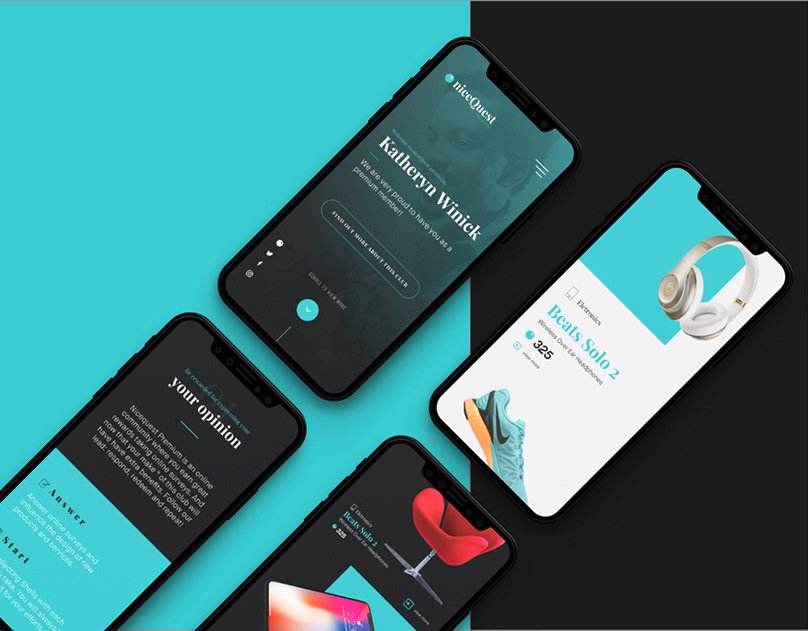
Consumers will browse using different devices depending on what they need. They may find your business using their smartphone but then do further research on their laptop or tablet.
Responsive websites allow your website to adapt depending on the screen size.
You will get:
- A consistent display of content.
- Improved accessibility.
- Flexible page designs.
- Easier to manage your website.
Provides a more consistent experience. You are not having to manage two different websites (desktop and mobile), you can have one responsive website.
7. Supports Better Conversion Opportunities
A mobile friendly website will help improve conversions.
If your website has clear, easy to understand information about your business and how to get in touch it will encourage people to take the correct action.
You should ensure that your website has:
A clearly visible contact area
- Easy to use contact forms
- Clearly visible information about your services/products
- Simple purchasing process for any online store
- Strategically placed CTAs
Whilst you can’t guarantee conversions by having a good looking website, ensuring there aren’t any barriers to using the site will help improve your chances of converting visitors into leads/customers.
Essential Features Every Mobile-Friendly Website Should Have
Creating a mobile-responsive website involves more than reducing the size of desktop content. It requires thoughtful design choices that prioritize usability and functionality.
| Feature | Why it matters |
| Responsive layouts | Adjust content to different screen sizes. |
| Simple navigation | Helps visitors find information quickly. |
| Readable typography | Makes content comfortable to read. |
| Optimized images | Reduces unnecessary loading time. |
| Touch-friendly buttons | Makes interactions easier on smartphones. |
| Clear CTAs | Guides visitors toward the next action. |
| Mobile-friendly forms | Makes inquiries easier to submit. |
| Fast loading pages | Improves the browsing experience. |
Combining these features helps create a website that is practical, accessible, and easy to use.
Mobile-First Design vs. Responsive Web Design
Mobile-first design and responsive web design are closely related, but they serve slightly different purposes.
Mobile-first design begins with the smallest screen size and prioritizes the most important content and functions. Web Designers then expand the layout for tablets and desktop screens.
Responsive web design focuses on making the website layout adapt to different screen sizes and devices.
Here is a simple comparison:
| Mobile-First Design | Responsive Web Design |
| Start with mobile screens. | Adapts to multiple screen sizes. |
| Prioritizes essential content. | Adjusts layouts based on screen dimensions. |
| Expands to larger devices. | Supports mobile, tablet, and desktop views. |
| Focuses on mobile usability from the beginning. | Focuses on consistent usability across devices. |
Both approaches can work together to create an effective website experience.
How Businesses Can Check If Their Website Is Mobile-Friendly
Testing your website regularly can help you to spot any issues that could impact mobile users.
Test different screen sizes: Check how your website appears on smartphones and tablets.
- Review navigation: Make sure menus, links, and buttons work correctly.
- Check text readability: Ensure visitors do not need to zoom in to read content.
- Test contact forms: Verify that users can enter and submit information easily.
- Measure website performance: Use Google PageSpeed Insights to identify loading and performance issues.
- Review mobile usability: Look for overlapping elements, horizontal scrolling, and poorly positioned content.
Regular testing helps businesses maintain a reliable website as devices, browsers, and user expectations change.
Why professional web design is important for your business
Creating a website involves careful planning of the layout, knowing how users interact, creating an improved function and ensuring each page works towards the objectives your business has.
Professional web design services will offer you:
- Website layouts using a user friendly approach
- Visual branding
- Responsive design
- Search friendly layout
- Contact/inquiry functions
- Improved performance and usability
Investing in a professionally designed and developed website will help lay down a strong base for your business to grow your online presence.
Conclusion
Having a mobile friendly design is an important aspect in building a professional online presence. With increased usability, SEO and improved customer engagement, having a responsive site will help ensure your business can provide a great experience for your visitors.
Take a look at your existing website to identify any issues around usability on mobile. Improve navigation, loading times and contact availability.
XTAPPS Software Solutions can help improve your digital presence by providing professional web design and development. We can ensure your website has the right functionality, usability and meets modern website requirements.
Ready to improve your business website?
Explore professional web design solutions to create a responsive, user-friendly website that supports your business goals.
Frequently Asked Questions
Company Portfolio